Designers today face the significant challenge of creating work that’s not only original and impactful but also meets a client’s unique needs, especially in our hyper-connected world, where influences are everywhere. But how do you ensure that a visual identity feels truly original?
Originality, by definition, is about being distinctive capturing something unique that doesn’t imitate anything else.
Recently, a friend mentioned that my logo reminded them of the Superman ‘S’ emblem, and I’ve heard similar comparisons to the Suzuki logo. So, as a designer, I’m left to wonder: is my logo genuinely original, or does it unintentionally echo these iconic brands?
Derivation vs. Inspiration
The line between derivation and inspiration can be subtle but significant. Inspiration is about drawing on elements from the world around us—visual motifs, shapes, colours, or styles—and reinterpreting them in a way that feels fresh and unique, ultimately reflecting the designer’s perspective.
Derivation, on the other hand, suggests a closer mimicry, where a design too closely resembles its source material and lacks enough reinterpretation to stand independently.
While inspiration respects the boundaries of originality, derivation risks blurring those lines, potentially leading to unintentional replication rather than a fresh perspective.
Comparisons
Let’s do a quick comparison here. For the sake of argument, we’re not going to look at colour usage but focus purely on the shape of these forms to see similarities between the designs.
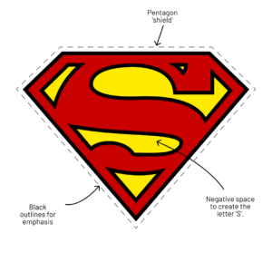
Superman Chest Emblem
Superman’s emblem symbolises power and protection.
The pentagon is elongated to create the shape of a shield, representing protection, while the negative space forms the letter ‘S’ which bulges slightly, representing his strength.
Bold line work emphasises this, though there have been many variations over the years without this.
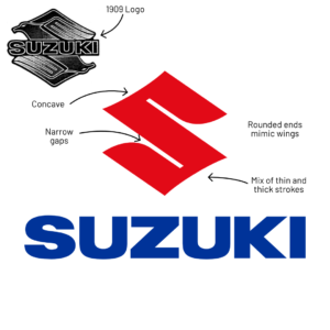
Suzuki
The Suzuki logo was originally a stylised pair of birds (likely birds of prey) arranged to create the shape of an ‘S’.
By 1958, the birds were replaced with the familiar ‘S’ monogram we see today, which has remained largely unchanged since.
Seen side by side, you can see how the current version follows the original bird logo’s shape, even mimicking the wings and beaks through curves and rounded corners.
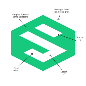
My Logo
I wanted to incorporate both initials of my name (J and S) in a compact, square design that could be used flexibly across various layouts, both vertically and horizontally. As I experimented with grids and shapes, I found that working with isometric grids allowed for more abstract shapes, leading to the J and S combining into a single form.
The letterforms’ stroke width is five tiles wide with an internal spacing of three tiles. The outer margin of the hexagon is also set five tiles from the letterforms. The overall design is intentionally angular, with crisp edges and sharp corners that reflect my slightly OCD nature.
Overexposure
Overexposure to widely recognised logos and symbols can cause audiences to make quick visual associations, even when designs are fundamentally different. When an iconic logo—like those of Superman or Suzuki—becomes deeply ingrained in public consciousness, audiences are more likely to draw parallels to it, even if another logo only loosely resembles its form or style.
This heightened sensitivity to familiar shapes and symbols can lead to superficial comparisons between otherwise distinct designs, often causing people to misinterpret or overlook the unique aspects of a new logo.
For designers, this poses a challenge: we must navigate a landscape saturated with instantly recognisable designs while striving to create something fresh and memorable. The task of crafting originality becomes harder, as designers work within a limited range of familiar visual elements that must balance familiarity and innovation without inviting misleading comparisons.
Conclusion
It’s safe to say that originality in design isn’t always about inventing something entirely new but reimagining familiar elements in a fresh and relevant way.
While people may see my logo as a recreation of these other brands, I see it as a personal exploration of familiar forms that is unique to me—a reflection of my own creative curiosity.
I hope you enjoyed my little breakdown here, it’s an expansive topic that you could waffle on about for years, I’m merely scratching the surface. If you want to check out some designs that really do push the boundaries of originilaty, then I highly recommend this article here on Creative Bloq.


